Am I the only one experiencing some broken link in the “new“, restyled SW online help?
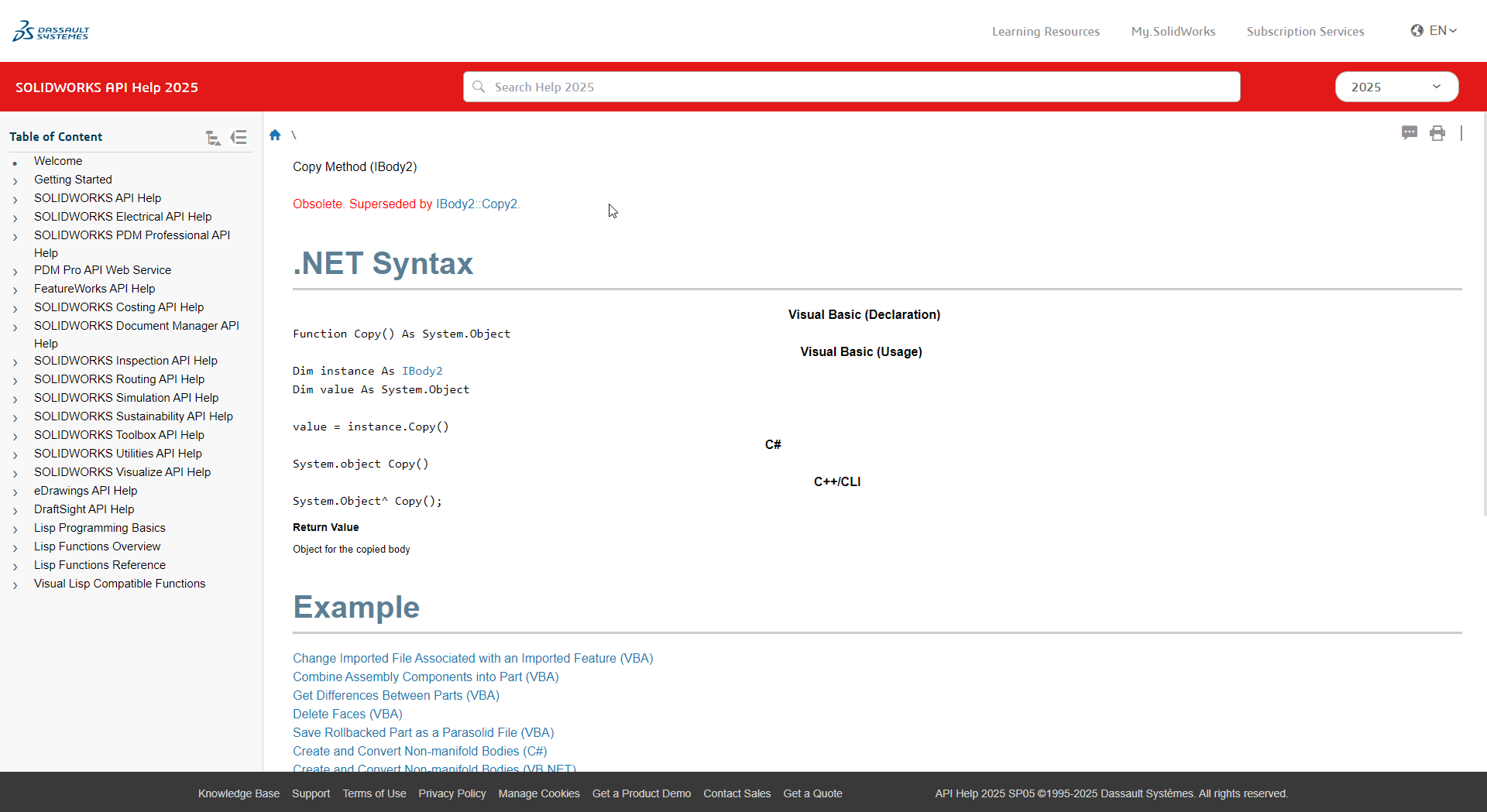
The new layout is quite useless, and the methods syntax are more difficult to read imho.
e.g. VBA, .NET and C++ not even separated with a border and sharing the same white background…
They updated the CSS style, overall ok but definitely looks worse for the api sections. This type of change cascades to all pages, and likely someone didn’t go thru each page doing a before /after comparison to check for issues.
Also broke the way it worked if you changed the version in the upper right. It used to keep you in the same section, now it knocks you back to the welcome page. This was useful to see changes between versions. Now I have to change the version directly in the url.
No. It’s broken for everyone. You can use the offline help in the meantime by un-checking “use web help” in the SW help menu.
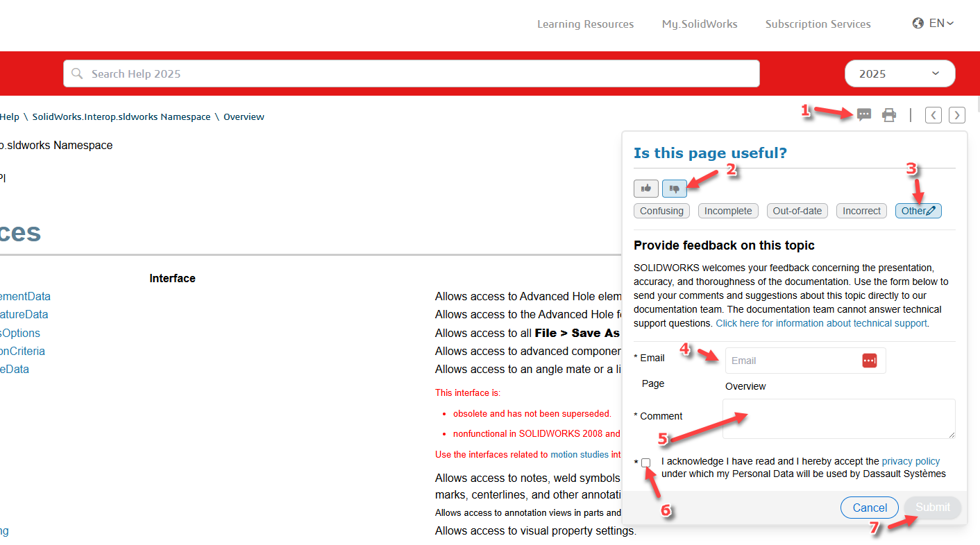
Also, please submit feedback on some page of the online help using the button in the top right, but please note that the immediate recipient of the feedback is responsible for the content of the page, not its presentation.
I have already passed these issues on to the SW team. They already fixed viewing previous versions of an API and they promised me they’ll fix the headings.
And my request for showing more than 5 results as the default will also be implemented
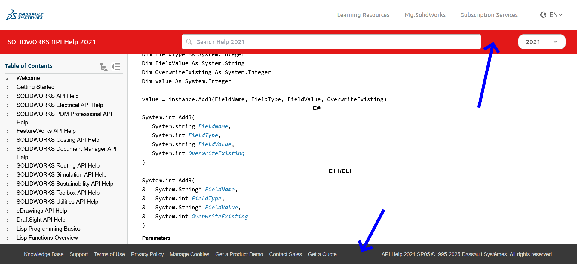
I have been in touch with the main person who handles the design and layout of the online help pages and am working with them to correct the API sections currently. One thing that will help speed this along is if more people submit feedback via the link in the upper right corner of the page (see screenshot below).
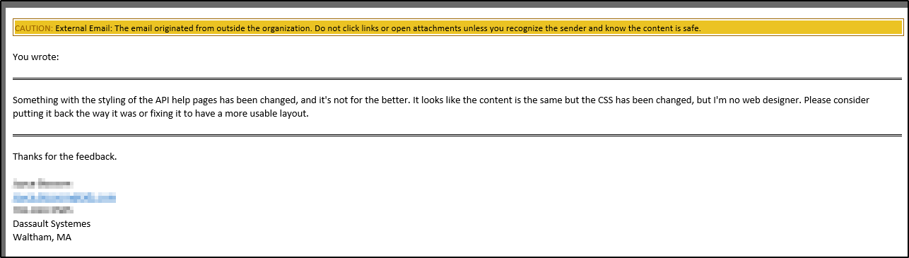
Yes… I’ve submitted several suggestions in the past, and they’ve always been very responsive. Always the same person too. Once there was some sort of doubt as to whether the fact that the behavior didn’t match the help was due to wrong help or an API bug. I forget whether it was API Help or API Support, but one of those two groups wanted me to play middleman in figuring out what was going on. I had to tell them to work it out between themselves and figure out which thing needed fixing.
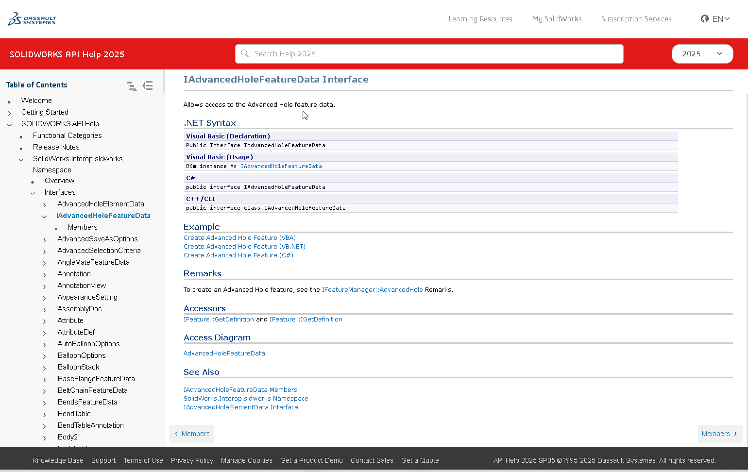
I just got an update that they are working on the corrections to the help and it should be updated by the end of the week. Here is a sneak peak at the updated format.
That is getting much better. The .NET Syntax section is back to sanity.
Is the Example body font still larger than the Remarks and other following sections?
IMO the h1 header style font-size could go from 40 to 30 in the live version. Maybe that’s addressed in the beta you have screen shot. I double checked browser zoom set to 100%.
The version picker in header works fine for me; Edge Dev, Version 143.0.3650.3 (Official build) dev
One other thing I’ve noticed, this isn’t new though, is the various example pages and the inline examples load with different fonts and sizes. Often it’s not monospace font and sometimes 10px size renders tiny and other times the 10px font-size looks perfect. I don’t understand web design, but if it would be possible to get anything code to be consistent Courier New and 10 without scaling that would be awesome.
If conversation about this is still ongoing, perhaps they could make these two bars disappear when scrolling? They take up vertical space without any benefit at all:
I get the idea, it’s rather strange that the footer is always in view. But you either have a very low resolution or very high scaling enabled. My monitor shows twice as much information on that page, so I really hope you don’t have to work with 700 pixels vertically.