I use that alot for imported assemblies.
Frederick_Law , HDS
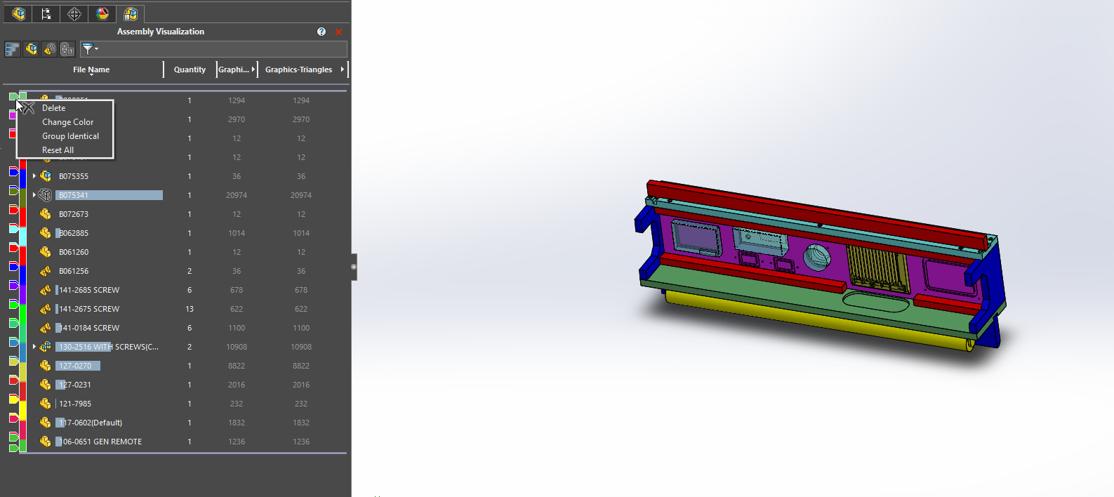
You can use Assembly Visualization for that and save it as a display state:
Alin had a presentation about it.
Edit: Ah, sorry Frederick_Law , I saw that you were asking for the drawing.
We use black and white for production drawings. The drawings which we have colors on are pneumatic, hydraulic, electric, and other things such as esthetics drawings(drawings where we position stickers and other things of that nature)
image.png
I’m arriving late to the party, but here are my two cents.
ISO, DIN and BSI make mandatory the use of black lines on white paper or white lines on blue/black paper.
No shaded views at all. this is to improve reproduction, readability and microfilming ( yes, microfilming is still a thing). From the practical point of view somebody somewhere will scan a print and reprint it in the wrong paper size and if your print/drawing has shaded views, you lost all detail.
Also, the dimensions shall also be in black, not in colour.
ISO and BSI accept the use of coloured lines only if you explain their meaning in a key. However, if you go up the ISO system for technical documentation matrix, Black lines on white paper take precedence.
Josuevivash Can you point me to the specific ISO standards that state this? I’ve never been able to find anything definitive.
Unfortunately the standards can’t keep up with the speed of change. Josuevivash mentions in standards Microfilm but Microfilm is dead, no company in their right mind would pursue a policy of microfilming data anymore and CAD data would be utter madness. We are in world where many drawings will never get printed anymore, the drawings in reality will only ever get viewed on a computer screen.
RichGergely I would agree, in general, standards always fail to keep up. For us, we print all drawings to PDF, they are rarely printed to paper. And in those cases, we picked colors that print to black and white printer fine and remain legible. AlexLachance pics above are great examples of color drawings that are more readable than just black and white line drawings.
Look at other drafting techniques where things are overridden and noted as something like “Lines removed for clarity”. It’s all about making clear and understandable drawings to manufacture by. Not using color and shaded views seems like drafting with one hand tied behind your back.
I suspect some here could get some insight into standards across the industries by visiting this site and retrieving the free PDF they offer.
Much is covered with regards to standardization and could be used as a baseline to create a small companies standards as well.
Food for thought anyway.
https://wbdg.org/ffc/army-coe/technical-reports-tr/erdcitl-tr19-7
Oooooh, Barricade design.
You know what I’m building around the house this winter.
You might be interested to know that the A/E/C CAD Standard (developed for US DoD use – I don’t know how widely adopted it is) that DeanD linked to was amended to specify a “dirty yellow” for exactly that reason, rather than the bright RGB = (255, 255, 0) that looks more visible on screen.
BTW, I wonder,.. in a Drawing view, does anyone know a way to save the “Draft Analysis” colors? As a Display State maybe or a Config?
I think making rainbow prints is a bad idea, but adding a little color here and there shouldn’t be an issue, if the colors are picked correctly. Back in the mid 90’s when I first started using autocad and didn’t know any better all of my dimensions were red. That was about as crazy as I got. (Maybe crosshatches were blue?)
It’s 2023. We’ve had inkjet printers sitting on our desk for 20 years. Is this really a problem? (Seriously asking. I only know my tiny corner of the world.)
Are you talking about actual model view of draft analysis? If you are there will be no way to do it, you can’t even save as JPG in the 3D model environment. Totally useless. Probably a SPR hanging around for it but you would have to first be able to save a jpg of the colours in the 3D environment if there was any chance to be able to do it in a drawing.
Hello Rich,
Yep. currently and in the past, I just copy/paste the draft analysis into the drawings.. but it would be kewl if we could have them linked?

More ink is used cleaning nozzle and calibrate.
Every time before we print color on the large HP. We need to print a few feet to clean the print heads.
Probably 15 to 30 minutes.
Laser is the way to go.
The problems with color.
Anyone here know and did color calibration on monitor and printer?
The only color that don’t need calibration to work is black and white.
And there is more than 50 shades of grey. We all got different grey.
And Pantone start charging everyone to use their standard means the only industrial color standard is gone.
Here is a good example of how not to add color. You’ve got the whole spectrum available to you, and you chose 2 colors that are difficult for me to tell the difference. (On my TV the colors were all but indistinguishable. It is better on my PC.)
image.png
My guess is those colors are green and yellow, but that definitely falls into the range affected by my color blindness.
It doesn’t help that they’re on a dark background.
The packaging industry uses “color blocks”, aka “process control patches”, as part of the printing process.
I suppose if one wanted to use a color on a print, but was a bit hesitant about everything printing the same grey tone, or looking too faint, they could do something similar in or near the title block that included all used colors. Thus anyone with a known accessibility issue could understand at a glance what they might find difficulty with.
Color Block on Lindt Chocolate Package.jpg
During covid, one of the news outlets loved to make maps that were all the same color, but different shades. Now there’s a state, in the middle of the country, and your trying to decide of that is shade #3 or shade #4, and the legend is too far away to be of any value.
This isn’t the worst example, but you get the idea.
image.png
Even if you aren’t colorblind, that seems like a bad idea.
I’m sure someone thought it was prettier this way, and legibility wasn’t considered.