I personally like to use as many hotkeys as I can remember. I used to tape a bunch of them on the side of the monitor, but I realized if I couldn’t remember them, they weren’t really speeding anything up.
I don’t use the S key because it guarantees an additional click and stroke just to get the interface. Gestures in general I find pretty inefficient and prone to error.
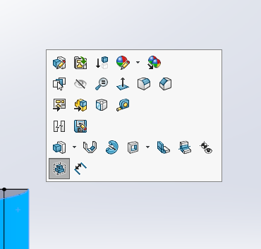
I do like the LMB context bars, but don’t like the RMB context bars because for them to be useful, you have to know what’s on them ahead of time, and if you have to read all the icons, you’ve got to read some text too. The RMB context bars pretty much have to be there because the RMB menu is so long, so you just have to learn to scan between icons and text when you’re looking for stuff that you don’t use all the time. If you have to use tool tips, you’re wasting time.
I generally do like the CommandManager, and put the Sketch toolbar on the right side. I don’t like the interface flipping back and forth between toolbars and the CM.
I like to pull the PropertyManager off the FeatureManager area and put it on another monitor, because when you have to select something from the FeatureManager, it’s a pain to have it covered up.
It’s nice to split the FeatureManager window so you can see the folders and planes at the top of the tree and the features at the same time. I usually work on single parts with long trees.
I like to save selections when I’m doing something repeatedly, especially if its something that keeps failing and I keep trying different things to get it to work.
I do like a touch interface, and when I have one that is sized properly and ergonomically positioned, I’ll use it.
In truth, I wind up using the stock interface a lot because when I do screen captures for books or articles or websites or whatever, readers find it annoying to have some funky custom interface to interpret before they can figure out what I’m doing. So I do wind up using the menus to get to less frequently used buttons. And I almost always use a white background because it’s the only way to go for screen shots. Yes, it’s a little annoying. I used to use a gray gradient background so that no colors got lost in the background.
To me, there are 3 conflicting goals of setting up the interface, you need to select which is most important to you:
- conserve interface space - less important with huge monitors
- conserve key strokes - involves moving hands from other peripheral devices
- conserve mouse motion
Possible device solutions:
- spaceball, definitely, plus you can use the programmable keys like hotkeys (keyboard shortcuts)
- mouse with 10 key keyboard, more programmable buttons
- voice commands - no good when you’re in an office with other people
- big giant touch screen at an angle that you can reach - I like the idea, but this seems tiring.