This is taking longer than I hoped. Not sure if I’ll be 100% successful. I need to recover a bunch of image files.
Re-upload as it seem that the old image is broken
I never made the free time to create my idea. I was thinking something like the letters in a foreshortened exploded view, with a few appearances thrown in like glass, steel, and plastic. Don’t hold up a poll for my lateness.
Well, hurry up! We can always add you late. I think I set Monday the 26th for the last day of the poll.
Not done with this. I’ll GIMP it out this evening.
FORUM.JPG
That’s pretty sweet Tom!
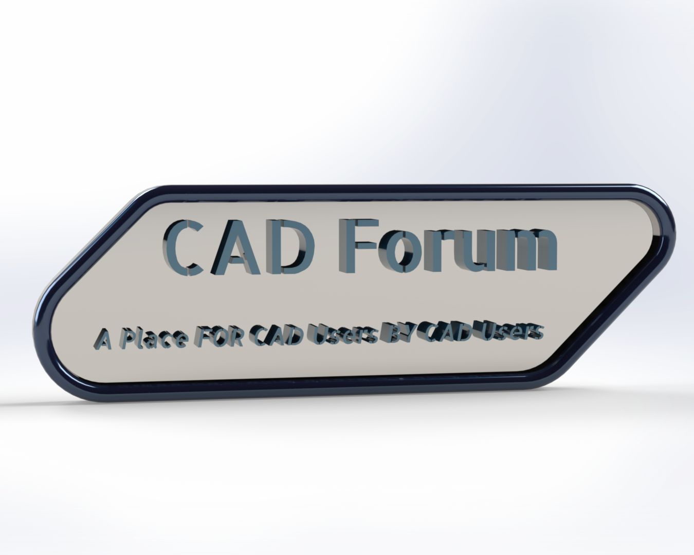
Here is my entry.
Modeled with SW and rendered with Visualize.
My submission.
Modeled with SW
Rendered with SW Visualize
Edited with Adobe Photoshop
Edit: I may post another rev tomorrow or Monday because this one I noticed is slightly cocked and the “A place for CAD Users by CAD Users” text is a little small.
Some comment, maybe try making the view “FLAT”? the 3D text make it hard to read.
To make the text stood out more in flat view, maybe also add in some draft or taper

Let’s put off the voting until Monday. Looks like there might be a couple of additional entries. Sorry Zhen-Wei Tee .
I’m lazy, but maybe someone can finish this? Note: artwork is not mine, but I did photoshop the logo onto the screen.

Thanks for the ideas Zhen-Wei Tee! I was in a hurry which is why it turned out like it did.
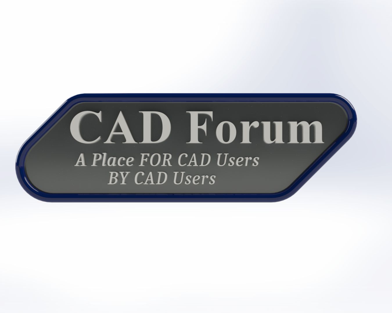
Here is a better one.
Here’s my advices
CAD Forum in a thicker font (perhaps addind bold would do the job?)
Have “A Place FOR CAD Users” and “BY CAD Users” on seperate lines and have them also in a thicker font.
You could replace the thicker font also with a black “offset” around letters, to make some sort of border.
Thanks for the advice AlexLachance!
That looks pretty good!
Thanks AlexLachance!
I now got a little better grasp of SW Visualize! This was my first time using it!
Maybe.
maybe.jpg